


How to make data engaging
- catie196
- Oct 16, 2024
- 5 min read
Updated: Oct 22, 2024
Let’s cut to the chase: the vast majority of academic writing is notoriously dull. It’s hard to read, harder to understand, and even harder to find concrete, real-life value in it.
Why?
It’s not the content itself—a lot of it is excellent research, meticulously conducted and discussed. It’s not the writers, either, who are (in my experience) brilliant people with brilliant stuff to say.
The problem is the genre itself. Much of academic writing is rigidly formulaic and aimed at one goal only: sharing information. Whether the reader cares about or understands that information is (apparently) superfluous. And because most academics receive so little training in how to write, they end up doing their best to emulate the ritualized, arcane stuff that’s already out there. The result is a vicious cycle: ineffective writers reward ineffective writers for accurately imitating their ineffective writing—all the while wondering why it is that most academic papers are never even cited let alone read.
The key training that I believe academics need in this critical aspect of their jobs is in engaging and convincing an audience, two crucial aims of effective communication that have nothing to do with facts and figures, and everything to do with storytelling. Research is supporting what the avid readers, writers, poets, playwrights, filmmakers, and filmgoers among us already know: storytelling is in our DNA, as critical to our survival as any of our other evolutionary advantages.
Here’s how to infuse life into your data to tell the compelling story of your research.
1. Embrace the art of a strong narrative
Storytelling transforms data from static information into an adventure narrative. Your goal with any paper should be to take the reader on that adventure from questions to clarity, from darkness to light. Begin by setting the scene. Except instead of “Once upon a time…” you’ll be opening your paper with phrases that situate the reader right in the middle of a particular area of research, industry, or issue. As you describe this issue, you’ll be informing your audience about many of the key things they’ll need to know to understand your work. Ultimately, after setting the scene for anywhere from a few sentences to a couple paragraphs, you’ll introduce the heart of your research: the relatable problem or question that led you to set out on this journey in the first place. Posing this problem or question is going to put the reader on the same journey—suddenly, they’re curious to know where you went to solve this query. Likewise, as you introduce your theory and/or data, treat it as a series of discoveries leading to insightful conclusions. These should never just be pieces of info tossed out like scraps. Instead, each one is a link in the chain that leads to your findings and (crucially) their significance. This narrative structure not only hooks your audience but also helps them remember and understand what they read.
2. Harness the power of visualization
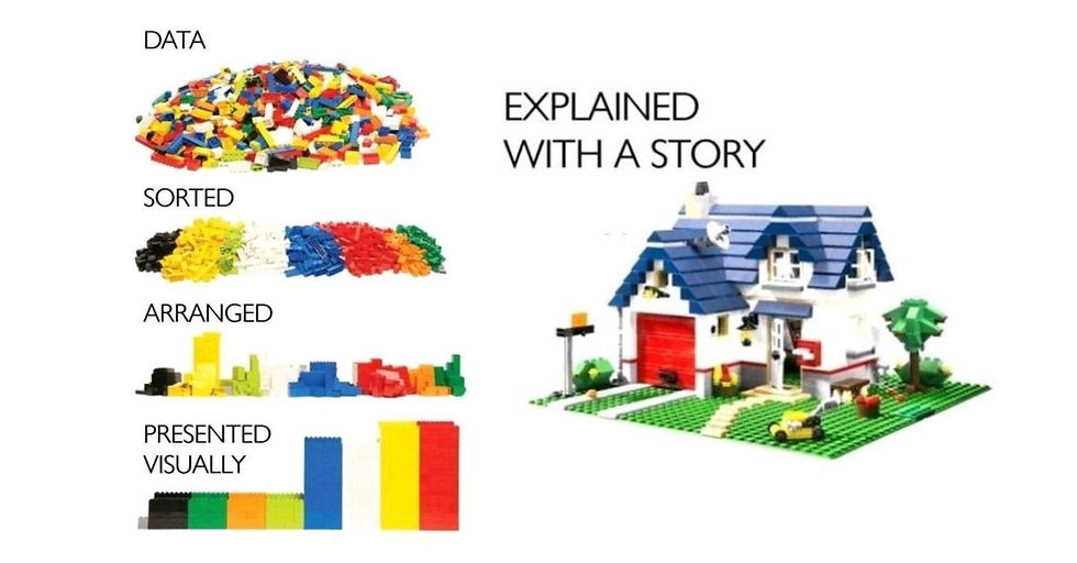
Every story is more engaging with pictures. Humans are deeply visual creatures and we love these cues and depictions of what we’re reading. In addition, they can help simplify complex information, making it more accessible and easier to digest. Use charts, graphs, and infographics to highlight key takeaways from your data (i.e., not just the data itself). For instance, check out the powerful graphic that inspired me to write this post in the first place—I love this comparison!
3. Introduce interactive elements
Engagement skyrockets when users can interact with data. Although you can’t hold a dynamic Q&A session in your paper, there are other ways to encourage readers’ interaction, depending on how your work is going to be published and disseminated. Interactive charts or dashboards allow users to explore and experience the data themselves, fostering a more personalized understanding. Platforms like Infogram and Google Data Studio offer tools to create these dynamic visuals yourself if the target context for your research allows for it. If all else fails, be sure you’re actually asking and answering the kinds of questions that readers might have as they read your paper (e.g., “Why the huge disparity between the two groups? We sought to investigate this gap…” or “The question of how these findings will affect HR managers is a crucial one…” etc.). This pseudo-“interaction” gives readers a voice within your work to identify with, leaving them feeling seen and understood as they navigate your data. In short, interactivity can transform passive consumption into active learning, making it both easier and more enjoyable for readers to understand your data and its importance.
4. Focus on relevance and context
Contextualizing your data in terms of its real-world applications is vital. Don’t wait until the “practical implications” section of a paper to illustrate exactly what the real and urgent danger is if no one ever reads this. Touching on this significance as early as you can in the paper (ideally as you set the scene, as described above) is going to help engage the widest possible audience for your research—maybe even non-academics, if you’re fortunate! That said, don’t miss the chance to make full and proper use of that practical implications section as well: even non-experts should be able to recognize the immense value of your work here, laid out in clear and accessible language for managers, organizations, employees, or anyone else you’d like to reach.
5. Integrate examples, personal narratives, and case studies
These can serve as “mini-stories” within the bigger story that you’re telling, concretizing the information and theories that you’re discussing with real people and outcomes. Qualitative research typically offers plenty of “humanized” data to draw from in this regard, but quantitative research can yield compelling results too. Capturing these findings with analogies and comparisons (especially comparisons to real physical things, if possible) is a great way to bring them to life and illustrate their importance. You can also highlight stories of individuals or groups affected by the data to build emotional depth and relatability among a wider audience.
6. End with the feeling you want to inspire
Your conclusion is secondary only to the introduction in terms of importance. Don’t waste it by simply restating your core findings and ending the conversation. Rather, the goal here is to leave people feeling how you hope they’ll feel about your data. How do you want them to react to this information? Are you hoping they’ll feel inspired? Deeply concerned? Empowered and informed? Ready to take action and conduct further research themselves? Whatever the emotional impact you’re aiming for, end on that note. You can close with an apt and powerful quote, a personal observation or story, an imagined scenario, a fitting example—anything that engenders that feeling you’re going for. One last appeal to your reader’s emotions makes your data that much “stickier,” so they’re more likely to be thinking about your research long after they’ve read it. A common and very effective emotion to aim for with your conclusion is hope—hope for a future informed by your findings, and for additional research that builds on your hard work.
Take it from someone who’s used these 6 strategies and more to help hundreds of business academics get their ideas published, funded, cited, and lauded: the key to standing out in a sea of dry academic writing is to make your important data more engaging—and the way to make your data more engaging is to tell a great story about it. Doing so will help you create an immersive experience that not only informs but also deeply impacts your target audience.


Comments